
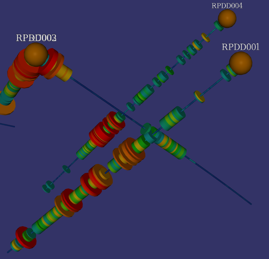
The Disc visualisation draws a stack of discs along each drill hole, coloured and sized from your downhole data. It is the main way to view logged values such as assays, and it works with both interval and point tables.
A disc visualisation is installed automatically when you add a drill group to the scene, but it is left unconfigured. You need to choose a table and the fields to display before it becomes meaningful. Open the editor by hovering over the drill layer and clicking the disc visualisation button.
Choosing a Table
At the top of the editor, use the Table dropdown to select the downhole table you want to display. All of the interval and point tables loaded for the group are listed here.
For interval tables each disc spans the length of its interval. For point tables there is no interval length, so each point is drawn as a short disc; a Max Gap control appears that limits how tall these point discs become. The height of a point disc is half the distance to the next point, capped at half the Max Gap value, so isolated points do not grow unreasonably large.
Colour and Radius
A disc has two properties you can drive from your data: its Colour and its Radius. These are configured on the two tabs near the top of the editor, each of which is an independent symbology class.
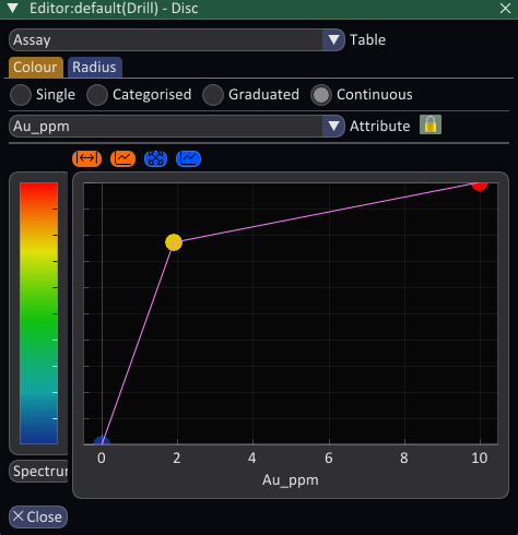
Each class can be set to one of four symbology types: Single, Categorised, Graduated or Continuous, selected with the radio buttons. In brief, Single applies one fixed value, Categorised maps discrete category values, Graduated maps a series of lower and upper values to a colour or value, and Continuous maps a numeric range to a colour ramp or a range of radii. The details of each type are described elsewhere.
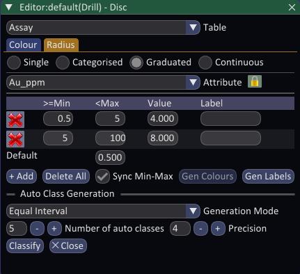
Combining Colour and Radius
The two classes are most powerful when used together to reinforce a single field. For example, you might colour the discs by an assay grade using a Continuous or Graduated ramp, and at the same time drive the Radius from the same grade with a Graduated class. High grade intervals then appear both hot in colour and fat in size, making them stand out at a glance.
By default the two classes are locked to the same attribute. Choosing a field on one tab automatically applies it to the other. This is indicated by the lock icon next to the Attribute dropdown.
Click the lock icon to unlock the classes when you want Colour and Radius to show different fields. For instance you could colour by Au grade while sizing by Ag grade, encoding two variables at once on the same discs. While unlocked, the Colour and Radius tabs keep their own independent attribute selections.